


|
|
|
|
|
|
|
|
|
|
||
|
|
|
|||||||||
|
|
||||||||||
|
|
||||||||||
|
|
||||||||||
|
|
||||||||||
|
|
||||||||||
|
|
||||||||||
|
|
|
|||||||||
|
|
||||||||||
|
|
|
|
|
|
|
|
|
|
|
|
Artist Bio
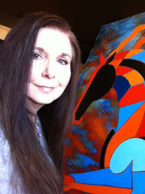
Born and raised in Virginia Beach, Va., Barbara Rush grew up with a deep connection
to animals. As a child she raised and released everything from rabbits and squirrels to
opossums and birds. At the age of 12, while at Girl Scout Camp, she fell in love with
horses and has ridden, drawn, and painted them ever since.
She holds a Bachelor of Fine Art from Old Dominion University (VA) and a Master’s in
Advertising (Design) from Syracuse University (NY). With over 20 years experience as
a graphic designer, her art is heavily influenced by lines, grids, and shapes. Her love of
finding shapes and forms within her subject matter is easily discernible within every
painting. She creates elegant outlines of horses, florals, and trees, then fills them with
heavily gridded shapes, or curves, that in the same moment break apart and hold the
subject matter together. Life is molded from lines, capturing the essence of its energy
on the canvas.
“I have been an artist all my life in one form or another. But, in 2005 it really
consumed me. I was perusing art at the High Museum and had the opportunity
to view a few cubist paintings up close. I was fascinated by their use of line
and form. Since I have been drawing and riding horses since childhood it was
a natural subject matter for me to explore new territory with, so I began playing
with geometric shapes within the body of the horse.” ~ Barbara Rush
In November 2006, Ms. Rush completed three giant red paintings, the first in
the series entitled, “The Tao of Equus,” which translates to The Way of the
Horse. Learn more...
Art Resume
I have been in a variety of galleries and shows throughout my life.
If you would like to see what I have been doing since 2000 Click here...
Artist Statement
My paintings were inspired by cubism and colorists such as Chagall. Learn more...
Education
Kempsville High School
Va. Beach, Virginia
Bachelor of Fine Arts
Old Dominion University
Norfolk, Virginia
Master of Arts, Summa Cum Laude
Syracuse University
Syracuse, New York
2011 - 2015
Gallery Representation
- Synergy Fine Art, 26 Webb Street Suite 3, Historic Roswell, 30075
(open to the public every Saturday 12 pm to 5 pm)
- Equine Divine, Aiken S.C.
Group Shows
- Arts Clayton Juried Show
- 30th Annual Arts in the Heart of Augusta, GA
- Barefoot in the Park - Merit Award Winner
- Art on the Creek, John’s Creek, GA
- Alpharetta Streetfest Art Festival, GA
- GDCTA Awards Gala, Equestrian Event, GA
- Francisco Farm Art Festival, Kentucky
- Castleberry Hills - Granite Room (the Big House Gallery)
- Alive After Five Gallery Crawl with Live music third Thursday of every month through October
2010
Gallery Representation
- Synergy Fine Art, 26 Webb Street Suite 3, Historic Roswell, 30075
(open to the public every Saturday 12 pm to 5 pm)
- Equine Divine, Aiken S.C.
Group Shows
- 25th Annual Sandy Springs Art Festival, GA
- 30th Annual Arts in the Heart of Augusta, GA
- Chattahoochee Hills Land Rover USEA Championships
- Art on the Creek, John’s Creek, GA
- Alpharetta Streetfest Art Festival, GA
- GDCTA Awards Gala, Equestrian Event, GA
- Francisco Farm Art Festival, Kentucky
- Equine Art Shows at Chukkar Farm, GA
- Alive After Five Gallery Crawl with Live music third Thursday of every month through October
2009
Gallery Representation
- Synergy Fine Art, 26 Webb Street Suite 3, Historic Roswell, 30075
(open to the public every Saturday 12 pm to 5 pm)
Group Shows
- Roswell Cultural Arts Center
-
Alpharetta Streetfest Art Festival
- GDCTA Awards Gala, Equestrian Event
- Charish the Future Gala, Furniture Bank of Atlanta
- Alive After Five Gallery Crawl with Live music third Thursday of every month through October
2008
Gallery Representation
- Two Doors Art: Studio & Gallery, Historic Roswell
(open to the public every Saturday 11:30 am to 4:30 pm)
Group Shows
- Alpharetta Streetfest Art Festival Winner: Spirit of the Show Award!
- "A Horse of A Different Color" Art Show Opening at Two Doors Art Studio and Gallery
- GDCTA Awards Gala, Equestrian Event
- Charish the Future Gala, Furniture Bank of Atlanta
- Alive After Five Gallery Crawl with Live music third Thursday of every month through October
2007
Gallery Representation
- Art Space International, Atlanta, GA
Solo Shows
- "A Horse of A Different Color" Art Show Opening at Pan Asia Bistro and Once & Again Books
Group Shows
- Alpharetta Art Streetfest, Alpharetta, GA
Additional:
• Adjunct Professor, Atlanta Art Institute, 2002
• Semifinalist, Syracuse University Woman’s Athletics
Logo Design Contest, Syracuse University, 1995
• Honorable Mention, AEJMC logo Design contest, 1995
• Judge for the Empire State School Press Association
Art and Literary Magazine Design Contest, 1995
• Graduate Assistantship Award, Syracuse University, 1995
Paintings
"The Tao of Equus Series was inspired by my love of horses and several cubist paintings and drawings on display in the High Museum back in 2005. Struck by the essense of the cubists' accomplishment of capturing movement on paper, I was compelled to see what the structure of the horse would look like as it shifted with each position of its body. I immediately began drawing restructured horses and playing with complementary curves and angles within the form of the horse. I played with the muscle movement in relationship to the speed of the gait and based my grid on the combination. " ~ Barbara Rush
Artist Statement
Barbara Rush is a very colorful and structured acrylic artist. Her work has been influenced by cubists such as Robert Delaunay and colorists like Marc Chagall, but her style is uniquely her own. She creates elegant outlines of horses, florals, and trees, then fills them with heavily gridded shapes, or curves, that in the same moment break apart and hold the subject matter together. Life is molded from lines, capturing the essence of its energy on the canvas.
Barbara is originally from Virginia Beach, Virginia and was educated in fine art and graphic design. She holds a Bachelor of Fine Art from Old Dominion University (VA) and a Master’s in Advertising (Design) from Syracuse University (NY). As a graphic designer, her art is heavily influenced by lines, grids, and shapes. Her love of finding shapes and forms within her subject matter is easily discernible within every painting she creates.
In her series of tree paintings, she has found places from which the forms can escape into the environment via gaps and swirls. Barbara’s imagination carries the energy of the tree into the earth, within the tree’s roots, then works its way up the trunk into the branches, wrapping the leaves into buoyant treetops.
All in all, Ms. Rush’s unique way of connecting with her subject matter, combined with her unique style and analytical analysis of interlocking shapes, makes her paintings resonate with vitality and significance in the art world.
Glassware Photograms
I have been experimenting with photograms since 1989 when I was introduced to the basic photogram technique by one of my college professors. Originally created by ManRay, in the 1920's, this technique was developed outside of the darkroom using sunlight and photo paper. Objects were placed on the paper, exposed to light, then the paper was developed and showed basically the outline of the object that had been placed on the paper.
The Electric Colors Series takes photograms to the next level and is a technique that I developed using transparent objects, multiple filters and dodging techniques in the black and white darkroom. Once I have my level one images on paper, I then take them into the digital darkroom and colorize them to accentuate the light as it is refracting and reflecting out of the objects.